Welcome to the IDEA LAB brand guideline.
An outline of the visual identity of our brand.
LOGO
On color
When combining the logo with brand colors, always ensure there is ample contrast in color pairings. The following examples are approved combinations.
Clearspace
When placing other elements nearby, be sure not to crowd the logo. Use the cap height and width of the ‘A’ as a spacing metric.
Dont’s
Do not reduce the value of the logo in our brand. Avoid the following treatments, unless specifically briefed by the Creative Team behind the brand.
TYPOGRAPHY
On type
Type weight provides hierarchy to distinguish between pieces of information. Use this as a guide for typeface weights employed in our brand.
Nexa Bold
Nexa Light
Hierachy
Use the following as a guide for creating a type hierarchy within our brand.
Header
Subheader
Body text - Lorem ipsum dolor sit amet, consectetur adipiscing elit, sed do eiusmod tempor incididunt ut labore et dolore magna aliqua. Morbi tincidunt ornare massa eget egestas. In tellus integer feugiat scelerisque varius morbi enim nunc faucibus. Facilisi nullam vehicula ipsum a arcu cursus vitae congue.
COLOR
White Smoke
CMYK:0+0/0/5
RGB:242/242/242
HEX: #F2F2F2
PMS:663 C
Navajo White
CMYK:0/20/37/0
RGB:255/205/161
HEX:#ffcda1
PMS:712 C
Lavender
CMYK:11/19/0/0
RGB:227/207/255
HEX:#e3cfff
PMS:530 C
Dark Slate Gray
CMYK:97/99/0/50
RGB:38/37/40
HEX:#262528
PMS:2738 C
Dark Gray
CMYK:0/0/5/33
RGB:170/170/161
HEX:#aaaaa1
PMS:414 C
Teal
CMYK:100/0/3/48
RGB:0/132/128
HEX:#008480
PMS:3282 C
Color
The primary palette are the core colors employed in our identity.
Combinations
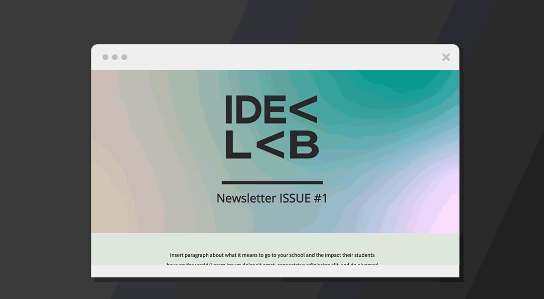
NEWSLETTER IMPRESSION